In the fast-moving world of digital marketing, your landing page can make or break your conversion success. A landing page isn’t just another web page it’s a purpose-driven, laser-focused tool designed to convert visitors into leads or customers. Whether you’re collecting emails, promoting a product, or running a campaign, your page must be built with strategic intent.
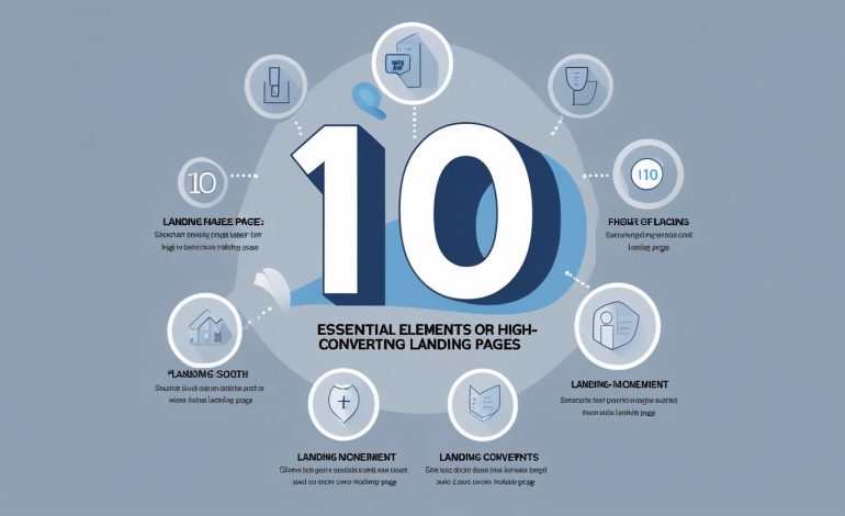
At crucial magazine, we’ve identified the 10 Essential Elements of High-Converting Landing Pages that consistently deliver strong ROI. These elements have been tried, tested, and proven across industries. If you’re looking to optimize your performance and turn more clicks into conversions, this comprehensive guide is your blueprint.
Clear and Compelling Headline
Your headline is your one-shot opportunity to grab attention, spark interest, and guide the visitor into reading further. The first 3-5 seconds are critical and a great headline can be the difference between a bounce and a conversion.
Keep It Concise
Effective headlines are brief yet powerful. Aim for under 10 words. The best headlines tell users what the offer is and hint at what’s in it for them, without overwhelming them with jargon or fluff.
Communicate Your Unique Value Proposition
Your headline should instantly communicate what makes your offer valuable and different. What can the user gain that they can’t get elsewhere? Your UVP should be instantly clear and obvious.
Focus on Benefits, Not Features
A high-converting headline emphasizes results, not specs. Instead of saying, “We build custom websites,” say, “Launch Your Dream Website in 7 Days.” Speak directly to the transformation your product or service provides.
Strong Visuals and Multimedia Content
Visual content plays a vital role in guiding attention, building emotional connections, and illustrating your offer’s value.
Include Key Visual Elements
Use relevant, high-quality visuals that align with your message. Hero images, product photos, videos, animated GIFs, and infographics can all reinforce your value proposition and break up text-heavy content.
Enhance Your Message
Your visuals should support and clarify your message, not distract from it. Consider using explainer videos, before-and-after images, or screen recordings to demonstrate benefits in action. Visual storytelling can help users visualize outcomes, making them more likely to convert.
Concise, Benefit-Focused Copy
Your copy should be clear, persuasive, and laser-focused on how your offer improves the user’s life or solves their problem.
Articulate the Real-World Benefits
Go beyond product features and talk about real outcomes. For example, instead of listing “24/7 customer support,” say “Get help instantly, any time of day.” This helps readers connect with your offer on a practical and emotional level.
Keep the Copy Scannable
Use headings, bullet points, bold fonts, and short paragraphs to guide the reader through the content. A well-structured layout lets users scan and absorb key points quickly, especially on mobile.
Avoid Information Overload
Don’t try to say everything at once. Highlight the most compelling points and leave room for curiosity. Clean design and spaced-out content make the page easier to navigate and more pleasant to read.
Prominent, Action-Oriented Call-to-Action (CTA)
Your CTA is the gateway to conversion. It tells users what to do next and should make taking action feel easy and rewarding.
Optimize Your CTA Design and Placement
Use contrasting colors to make your CTA stand out. Place it prominently above the fold and repeat it in strategic places as users scroll. The copy should be action-driven: “Start My Free Trial,” “Get My Quote,” or “Download Now.”
Test and Optimize Your CTA
Even small tweaks can yield major results. A/B test different CTA phrases, button sizes, placements, and even color schemes. Use heatmaps and scroll maps to see where users lose attention and refine accordingly.
Social Proof and Credibility Indicators
Trust is critical, especially for first-time visitors. Social proof builds that trust quickly by showing how others have benefited from your offer.
Showcase Testimonials and Reviews
Highlight customer testimonials with photos and names when possible. Use review snippets from Google, Trustpilot, or other platforms to reinforce your credibility and relatability.
Present Case Studies and Performance Statistics
Add weight to your claims with stats and case studies. “Increased leads by 230%,” or “Helped 300+ clients scale online” — this kind of data can seal the deal.
Mobile-Friendly, Responsive Design
With mobile traffic surpassing desktop, it’s crucial your landing page offers a seamless mobile experience.
Ensure Flexibility and Readability
Use a responsive framework that adapts fluidly to different screen sizes. Font sizes, buttons, and images should scale properly and remain fully readable on smartphones and tablets.
Prioritize Mobile-First Design
Design for mobile from the beginning — not as an afterthought. Mobile users scroll more than they click. Keep content vertically aligned, and CTA buttons thumb-friendly.
Fast Page Loading Speed
A slow-loading page is a conversion killer. Even a one-second delay can drastically impact bounce rates and SEO.
Optimize Images for Faster Loading
Compress images using tools like TinyPNG or serve images in next-gen formats like WebP. Avoid oversized background videos unless absolutely necessary.
Minimize Scripts and Unnecessary Elements
Eliminate unused CSS, JavaScript, and plugins that bog down performance. Load scripts asynchronously, and reduce reliance on third-party tools unless critical.
Simple and Focused Layout Without Distractions
Every design decision should lead the user toward your desired action — nothing more, nothing less.
Center the Layout Around a Single, Prominent CTA
Avoid clutter, sidebars, or navigation menus that tempt users to click away. A clean, minimalist design keeps users focused on what matters most — your offer and its benefits.
Easy-to-Complete Forms Asking for Minimal Information
Your form is often the final hurdle between a user and a conversion. Make it as smooth as possible.
Strategies to Simplify Forms
Only request essential fields. Use smart defaults, dropdowns, and auto-fill options to save users time. You can collect additional info later via follow-ups or onboarding.
Design Considerations for Optimized Forms
Visually highlight form fields, use clear labels, and ensure error messages are helpful. Test form placement and ensure full functionality across devices.
Clearly Communicated Unique Selling Proposition (USP)
Your USP is what sets you apart from the competition — make sure it’s unmistakably clear.
Communicate Your USP Through Headlines
Use bold headlines, supporting copy, and visual hierarchy to draw attention to your biggest selling point. Whether it’s price, quality, service, or speed, make it front and center.
Tips to Craft an Effective USP
Your USP should be specific, easy to understand, and benefit-driven. Avoid vague terms like “best service.” Instead, try “Guaranteed 24-hour delivery, or it’s free.”
FAQs
What are the top elements of a high-converting landing page?
The top elements include a strong headline, visuals, compelling copy, CTA, social proof, mobile responsiveness, fast speed, minimal distractions, simple forms, and a clear USP.
How can I improve my landing page conversions?
Focus on optimizing your headline, making your CTA stand out, simplifying forms, reducing page load time, and adding credible testimonials or statistics.
How long should my landing page be?
Shorter pages work well for simple offers, while complex or high-ticket products may benefit from longer pages with more information and proof points.
Why does social proof increase conversions?
Social proof builds trust by showing potential customers that others have successfully used and benefited from your product or service.
How do I test landing page effectiveness?
Use A/B testing tools like Google Optimize or Unbounce. Measure conversion rates, scroll depth, CTA clicks, and bounce rates to make data-driven improvements.
Conclusion
Building a landing page that converts consistently isn’t about guessing it’s about precision, strategy, and user psychology. By applying these 10 Essential Elements of High-Converting Landing Pages, you’ll create an experience that doesn’t just attract clicks but compels action.
At crucial magazine, we believe in designing landing pages that serve as conversion machines streamlined, persuasive, and user-first. Whether you’re optimizing an existing page or building from scratch, keep these principles in mind and watch your results skyrocket.